
You’ve spent good money on precision ag, GPS guided equipment. Your rows are planted straight, your pesticide sprays are very precise, and you have improved harvest efficiency. You’re set up for variable rate planting and you have a yield monitor, but aren’t quite sure what else to do with them? Here are some ideas to use your existing technology to further increase the efficiency of your farm.
Let’s say you’ve always planted a certain crop population (# of plants / acre) like the guidelines for 36″ rows in the chart below, but you know that some areas of your field are more productive than others. It makes sense to plant the more productive areas with a higher population, and the weaker areas with a lower population. The problem is you really don’t know the ideal plant populations for these different areas of your field?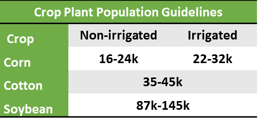 Start with a map of your field. I recommend choosing a field with large variability, because your return will be greater. Pencil in the areas of high and low productivity. (There are other ways to delimit your field, such as by soil type or zone mapping.) Your map might look something like this:
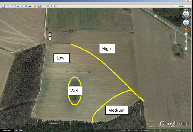
Figure 1. Divide your field into zones. This example map is based on experience with zones of high, low, and medium productivity. Zones could be by soil type, zone mapping, or grid sampling.
Now choose some rates that you’d like to try. Suppose your usual population is 34,000 plants/ac. You want to choose some higher populations and lower populations. Let’s say 30k, 36k, 42k and 48k plants/ac. You want to select populations that will give yield loss at both ends of the extreme so that you can find the sweet spot in the middle.
You need to repeat each of those populations in each zone so that we can get a good average yield for each zone. In this example, you’ll repeat four times. So you have four populations repeated four times in each zone, for 16 ‘plots’ in a zone. Randomize the populations across each zone.
Now it’s time to fit those plots on the map. It’s best to have larger plots so we can see the data on the yield monitor; 100’ x 100’ plots are a good size, but just a suggestion. If you have a 4-row planter on 36” rows, eight passes will make a 96’ wide plot. So we’ll make our plots 96’ wide by 100’ long out of convenience. So now our map looks something like this:
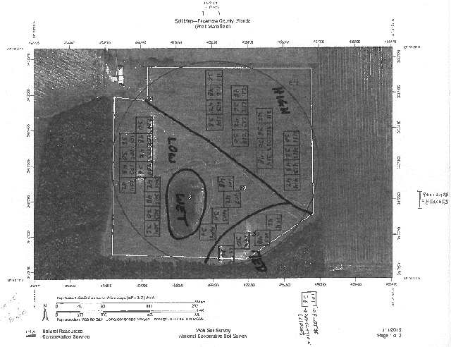
Figure 2. Four populations repeated four times in each zone. Bring this map to your dealer with a USB drive. Note that the lower number in each plot is the population. You’ll also note that we could not fit four replications in the ‘medium’ zone, but we’ve fit in what we could.
Now bring this map to your dealer, who should be happy to help write the prescription for you using the right software package for your planter. Bring a USB drive with your field on it. Ideally, they should be able to work with your map, hand it back to you when it’s ready (they may need some time), so you can plug it into your display, and the planter will know what to do. The dealer may need to visit your field to mark out boundaries. Regardless, the map they give you would look something like this:
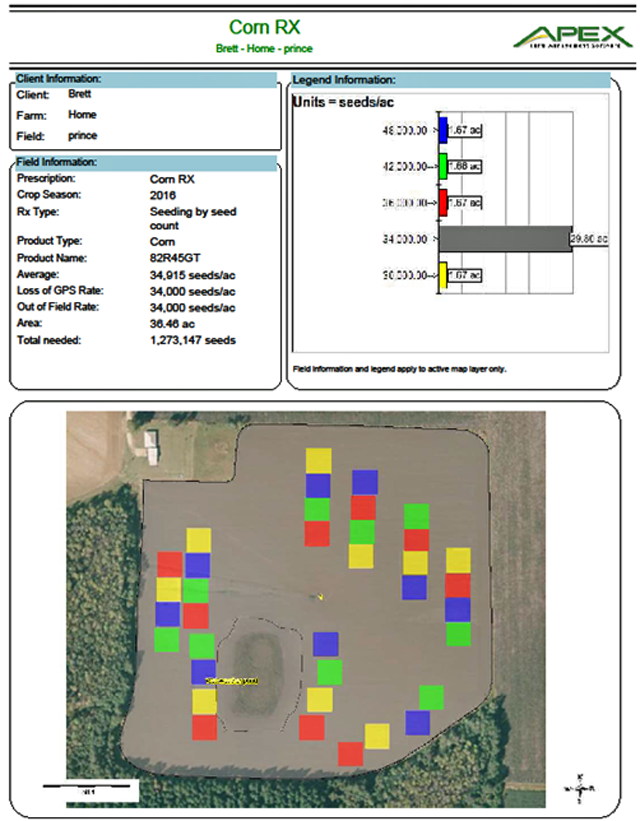
Figure 3. An example of the prescription map you’ll get back from the dealer. This information will be on the USB drive, so your planter will automatically plant the correct populations in each area.
Prior to harvest, make sure your yield monitor is calibrated, or all your work will be for nothing. After harvest, overlay your yield map with your plant populations, and average each population within a zone. The data for each zone might look like this (this data is fictitious):
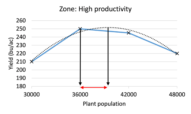
Figure 4. We have identified the optimal plant population range in this example zone for that year.
The solid blue line are the actual data, which would lead us to think that 36,000 plants/ac is the best population for this zone. If you enter the data into Excel, it can generate a curve on the graph (the dotted line). To determine the optimal population for this zone, you can find the maximum yield on the curve and draw a line down to the population, which is about 40,000 plants/ac (solid arrow line), which corresponds to a little over 250 bu/ac.
You will now know, for that year, that your optimal plant population in that zone was 36,000 to 40,000 plants/ac. Repeat this for at least three years to get a good idea of what your populations should be for each zone.
If you want assistance setting this type of on-farm trial, contact your county extension agent, so they can set up an appointment with me to develop something that will work for your farm.
- Four Early-Season Lessons from 2020 Peanut Production - April 9, 2021
- Sprayer Calibration Tables – Calibration Made Easy - October 30, 2020
- Stand Issues – Should You Replant Your Peanut Field? - May 15, 2020